Plugin Parameters and Graphical Interface Rendering
Table of contents
- Step 1: Available User Interface Elements
- Step 2. Define the UI Elements
- Step 3. MIDI In Widget
- Step 4. MIDI Out Widget
For this Stage of Deployment, You should modify the following file
Step 1: Available User Interface Elements
The wrapper allows for automatic rendering of the plugin’s graphical interface. All you need to do, is to decide what sort of UI elements you would like to have in your plugin.
At this moment, only vertical sliders, rotary knobs and buttons are supported. More UI elements will be added in the future.
Once you have decided what sort of UI elements you would like to have in your plugin, continue with the following steps.
The UI elements can be organized in tabs. Each tab can have any number of sliders, rotary knobs and buttons.
Step 2. Define the UI Elements
In Configs_GUI.h, you can define the UI elements that you would like to have in your plugin.
namespace Tabs {
const bool show_grid = true;
const bool draw_borders_for_components = true;
const std::vector<tab_tuple> tabList{
tab_tuple
{
"Tab 1", // use any name you want for the tab
slider_list
{
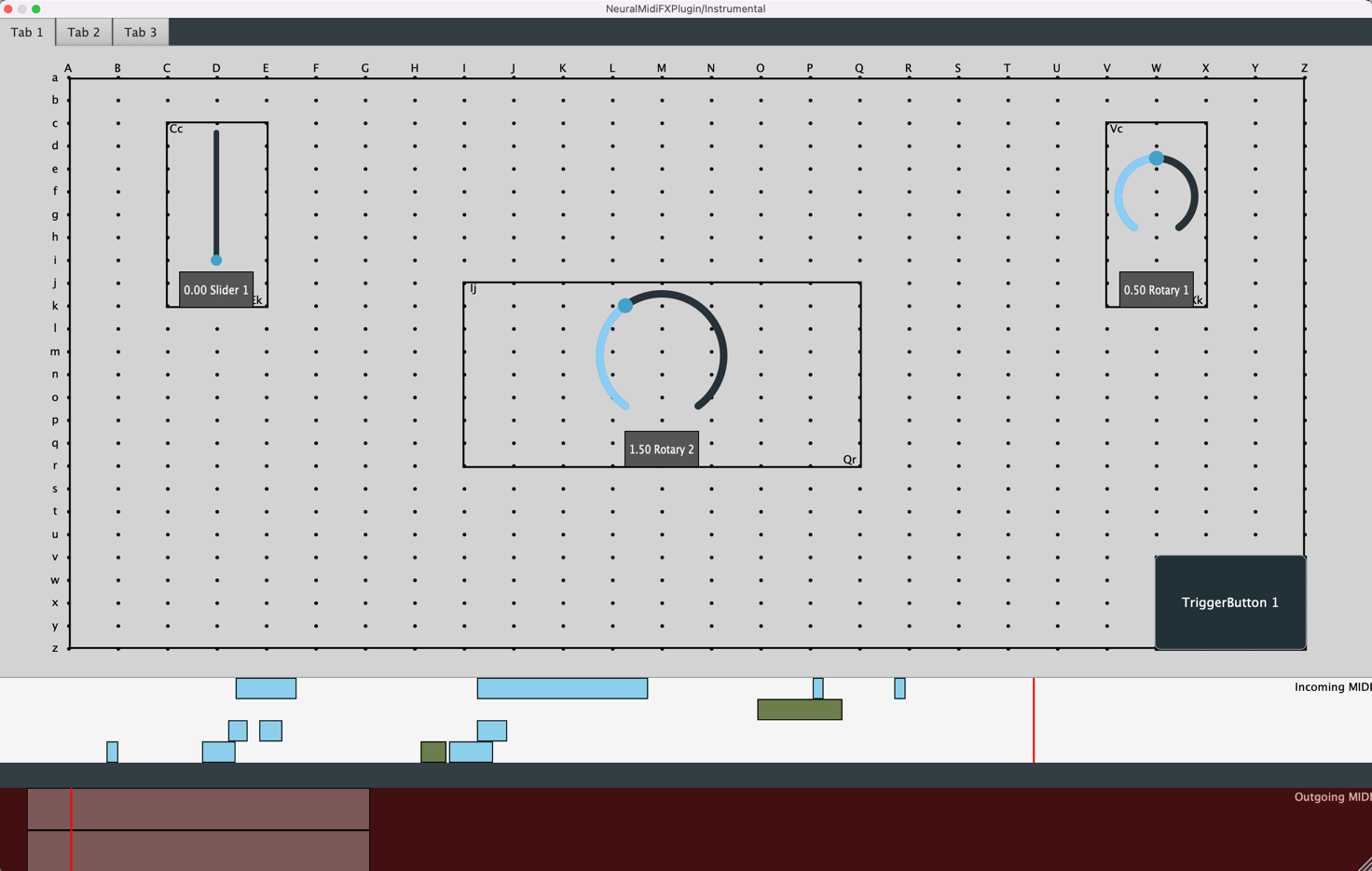
slider_tuple{"Slider 1", 0.0, 1.0, 0.0, "Cc", "Ek"}
},
rotary_list
{
rotary_tuple{"Rotary 1", 0.0, 1.0, 0.5, "Vc", "Xk"},
rotary_tuple{"Rotary 2", 0.0, 4.0, 1.5, "Ij", "Qr"}
},
button_list
{
button_tuple{"TriggerButton 1", false, "Wv", "Zz"}
}
},
...
}
Adding a Tab
To add a tab, add a new tab_tuple to the tabList vector.
Showing a Grid (For Design Stage)
To show a grid, set show_grid to true. To hide the grid, set show_grid to false. The grid is useful for aligning the UI elements in the plugin. Each point in the grid is a capital letter (column) and a lowercase letter (row).
Specify if Borders Should be Drawn for the UI Elements
To draw borders for the UI elements, set draw_borders_for_components to true. To hide the borders, set draw_borders_for_components to false.
Adding a Slider
To add a slider, add a new slider_tuple to the slider_list vector. Each slider tuple has the following format:
Syntax:
    slider_tuple{label, min_val, max_val, default, top_left_corner, bottom_right_corner}

Example:
    slider_tuple{"Slider 1", 0.0, 1.0, 0.0, "Cc", "Ek"}
Adding a Rotary Knob
To add a rotary knob, add a new rotary_tuple to the rotary_list vector. Each rotary tuple has the following format:
Syntax:
    rotary_tuple{label, min_val, max_val, default, top_left_corner, bottom_right_corner}

Example:
    rotary_tuple{"Rotary 1", 0.0, 1.0, 0.5, "Vc", "Xk"}
Adding a Click Button
To add a click button, add a new button_tuple to the button_list vector. Each button tuple has the following format:
Syntax:
    button_tuple{label, false, top_left_corner, bottom_right_corner}

Example:
    button_tuple{"TriggerButton 1", false, "Wv", "Zz"}
Adding a Toggle Switch Button
To add a toggle switch button, add a new button_tuple to the button_list vector. Each button tuple has the following format:
Syntax:
    button_tuple{label, true, top_left_corner, bottom_right_corner}

Example:
    button_tuple{"ToggleSwitchButton 1", true, "Wv", "Zz"}
Step 3. MIDI In Widget
A MIDI In widget can be added to the bottom of the plugin to allow for the user to drop a MIDI file into the plugin. Moreover, the widget can be used to visualize incoming MIDI messages. To enable this widget, modify the following line in NeuralMidiFXPlugin/NeuralMidiFXPlugin/Source/DeploymentSettings/GuiAndParams.h:
    namespace MidiInVisualizer {
        // if you need the widget used for visualizing midi notes coming from host
        // set following to true
        const bool enable = true;

        // if you want to allow user to drag/drop midi files into the plugin
        // set following to true
        // If active, the content of the midi file will be visualized in the
        // MidiInVisualizer and also be provided to you in the InputTensorPreparatorThread
        const bool allowToDragInMidi = true;

        // if you want to visualize notes received in real-time from host
        // set following to true
        const bool visualizeIncomingMidiFromHost = true;
        // if playhead is manually moved backward, do you want to delete all the
        // previously visualized notes received from host?
        const bool deletePreviousIncomingMidiMessagesOnBackwardPlayhead = true;
        // if playback is stopped, do you want to delete all the previously
        // visualized notes received from host?
        const bool deletePreviousIncomingMidiMessagesOnRestart = true;
    }
The content of a dragged in MIDI file will be provided to you in the
InputTensorPreparatorThread. More on this in the ITP section.
Step 4. MIDI Out Widget
A MIDI Out widget can be added to the bottom of the plugin to allow for visualization of the generations. To enable this widget, modify the following line in NeuralMidiFXPlugin/NeuralMidiFXPlugin/Source/DeploymentSettings/GuiAndParams.h:
    namespace GeneratedContentVisualizer
    {
        // if you need the widget used for visualizing generated midi notes
        // set following to true
        // The content here visualizes the playbackSequence as it is at any given time
        // (remember that playbackSequence can be changed by the user within the
        // PlaybackPreparatorThread)
        const bool enable = true;

        // if you want to allow the user to drag out the visualized content,
        // set following to true
        const bool allowToDragOutAsMidi = true;
    }